
One of the more challenging aspects of quiltmaking can be how to choose fabric colors for a quilt. The seemingly daunting task may often stop us quilters in our tracks, quenching our creative fire and delaying our next make.
I'm here to tell you that it doesn't have to be this way! With a few simple tools, choosing colors for your quilts can be one of the most enjoyable parts of the process.
In this post, I give you one of the methods I love to choose colors for my quilt projects. I come back to this method over and over again because it's tried and true and simple to use.
With this color-choosing method, you don't need any special color theory knowledge or even a color wheel to achieve stunning results. You'll be able to come back to this way of choosing colors time and again because it just plain works!
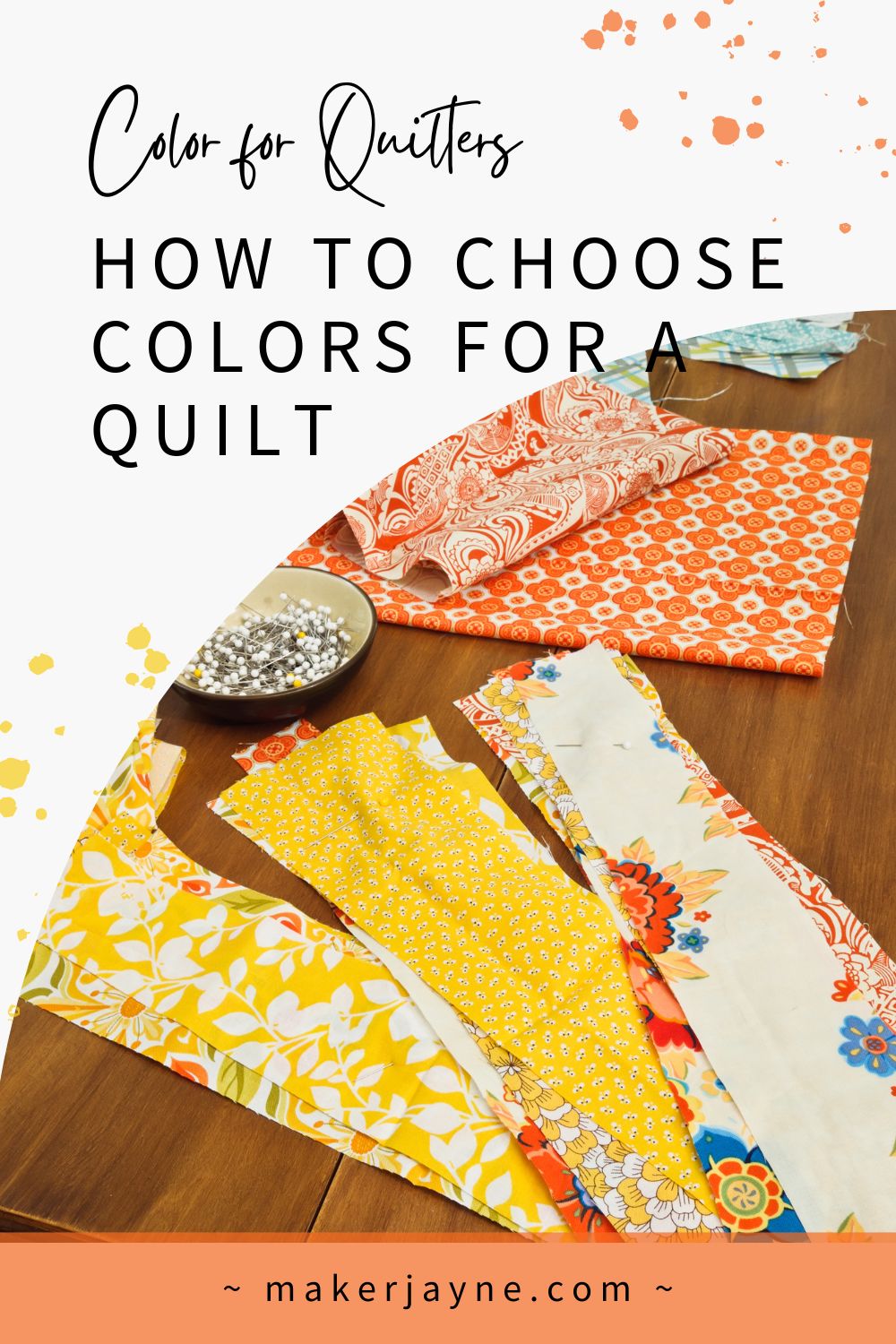
How do you pick quilt colors?
The easiest method for how to choose colors for a quilt is to look at nature. Nature is the best quilt color palette generator in existence and it's all around you.
You are surrounded by an endless amount of gorgeous color palettes every day. All you have to do to create one of your own is to pay attention to your surroundings as you're out and about.
When you're strolling through your neighborhood on your evening walk and you pass by that beautiful yard that you always find yourself admiring, take note of what's drawing you in.

Is it the many different colors that blanket the area? Or is it because the homeowner limited the colors to only a few? Does the texture of the ivies and ferns stand out to you? Or perhaps the placement and structure of the paths or fencing in relation to each other, the rest of the yard, and the house?
A really fun way to approach choosing fabric colors for a quilt is by starting with something in nature that really inspires you: flowers, a mountain landscape, or the ocean.
Colors That Look Good Together
Colors in nature always look good together so it can be a reliable source of color inspiration for you.
Today we're going to look at butterflies for inspiration on how to choose colors for a quilt! As you know, butterflies come in an infinite number of different colors and many different forms.
By doing a quick search online you'll find tons of butterfly images to choose from. You can add a color or two to your search phrase for more options. For example, try typing in "green butterfly" and see what comes up.
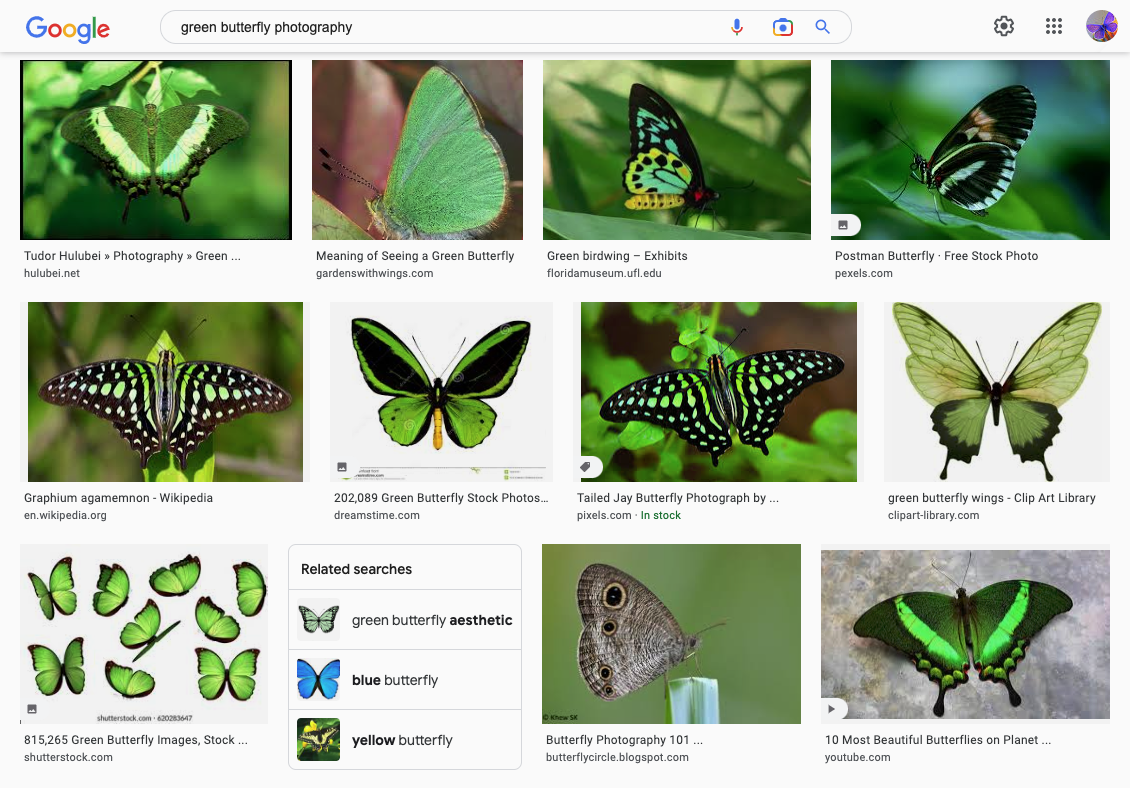 The above examples are what appeared in my search for "green butterfly photography".
You can do this type of search with each color of the rainbow until you find a butterfly that has an interesting color combination that you like. This search method is a great way to find out what colors go well together and see potential quilt color combinations.
Want to know what color goes well with purple? Search for "purple butterfly" to see what other colors might be found with purple in nature. (By the way, you're not limited to butterflies. That is just the example I'm using here. You could also do this with flowers for more examples).
 Above is what appeared in my search for "purple butterfly".
When you look at the images, spend a little time on each one and ask yourself, "What am I especially drawn to? What color in this butterfly is surprising or stands out? What other colors do I see that are more subtle? What colors help the other colors to stand out?"
By asking yourself these questions, you'll learn more about your unique color tastes and what you're drawn to. The more familiar you are with what you like and dislike the easier it will be for you to choose colors for a quilt.
Let's take a look at a few specific images of butterflies below and how I used those color combinations in my latest English paper piecing pattern Flowers and Butterflies #3. Keep in mind you can use this method to choose colors for any quilt project.
Choosing Quilt Colors
After several different color searches, I chose three different color combinations to use for my quilt project. Below you'll see the images that popped up in my searches and what I came up with based on those color combinations for my English paper pieced project.
Have a look at each of the butterfly images. What do you notice? What stands out to you? What surprises you? What subtle colors do you notice?
Green Color Inspiration
The first search I did was for "green butterfly". Here is an image that came up from the Florida Museum of Natural History.
Do you see the subtle bits of yellow within the green of the butterflies below? How about the subtle aqua color within the green on the underside of the wings?
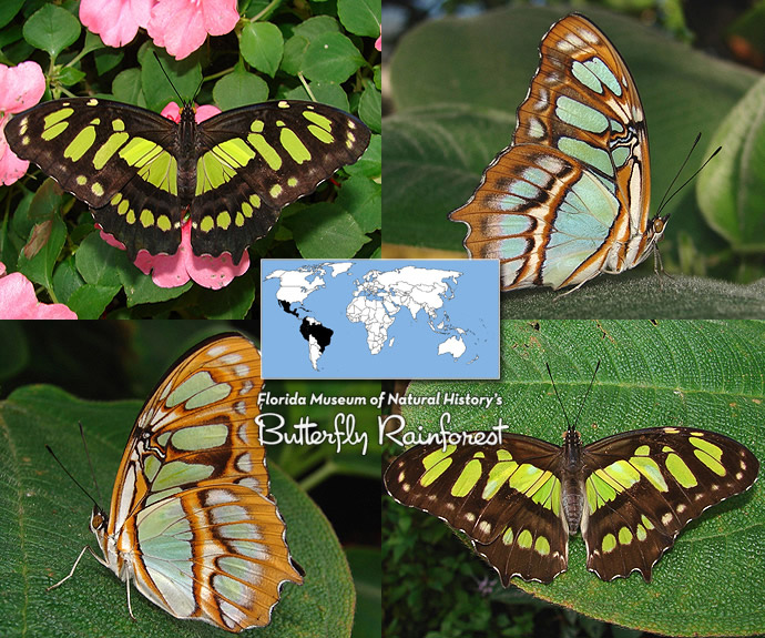
You could pull fabrics that match a butterfly exactly, like the aqua green, brown, white, and gray from the image above. Or you could use one or two colors from a single butterfly to use as a jumping-off point and then add other colors to it.
Let's take a look at one more green butterfly I found online...
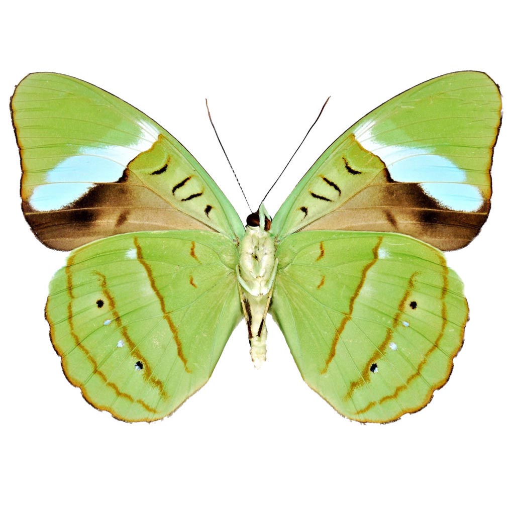 Nessea hewitsoni butterfly from Peru.
This one is very interesting. I love the pop of aqua and the subtle brown tones in this one. What also struck me was the layout of the colors and how they are arranged within the butterfly.
Because my quilt project was an actual butterfly, I took advantage of the different designs I found as inspiration for how I could lay out my different fabric colors within my butterfly project. Here is what I came up with based on the example above:
 The color layout I chose is based on my "green butterfly" search results.
After I pulled my fabrics together for this one, I decided I didn't like how the brown looked. So I changed it up and added more aqua to my project. I also played with a lighter fabric that had both aqua and green in it to add a bit of contrast to the overall project. Then I threw in a little fussy cutting for fun!
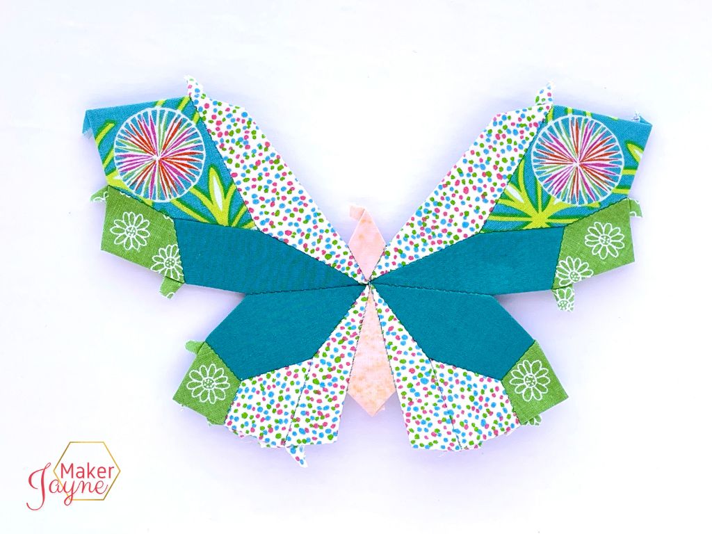 My "green butterfly" fabric color choices.
Orange Color Inspiration
For my next color hunt, I searched for "orange butterfly". This first example from the Florida Museum of Natural History is a fun one. What stands out to you when you look at these butterflies? What subtleties do you notice?
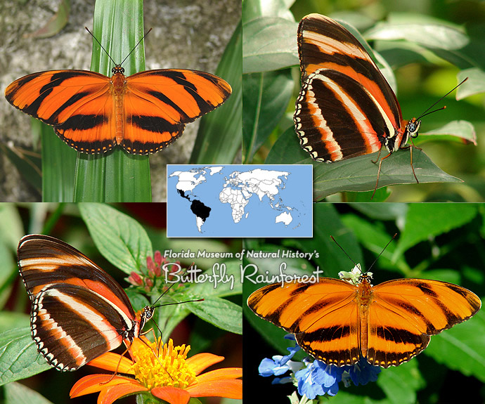
Perhaps the way the orange, white, and black contrast with one another? What about the arrangement of the colors? Do you see how you could incorporate something similar into your next quilt project?
Here is an interesting butterfly with a lot of cool things going on. I immediately noticed the subtle difference in the oranges, going from light, to medium, to dark orange. I also noticed some very light yellow in the outer portion of the wings in this one.
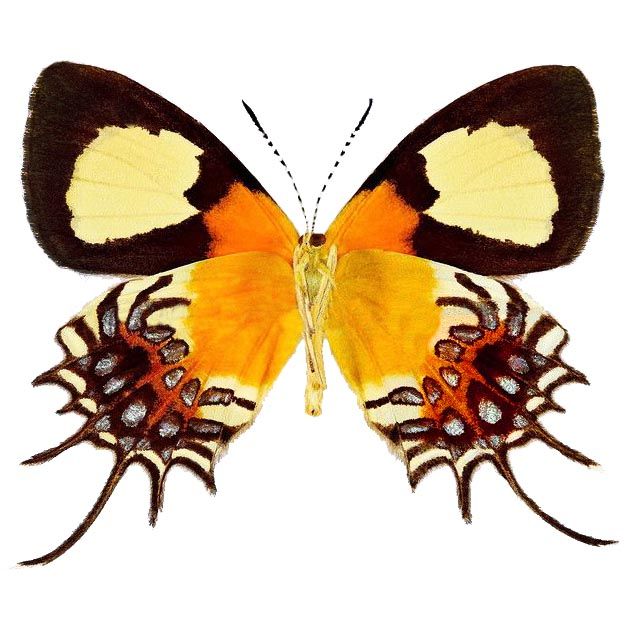
For my EPP butterfly project, I decided to incorporate those subtle differences in orange by using two different orange fabrics - one lighter than the other. I also liked the contrast between the orange and black in the butterfly example above so I decided to play with contrast by adding a small bit of purple to my project.
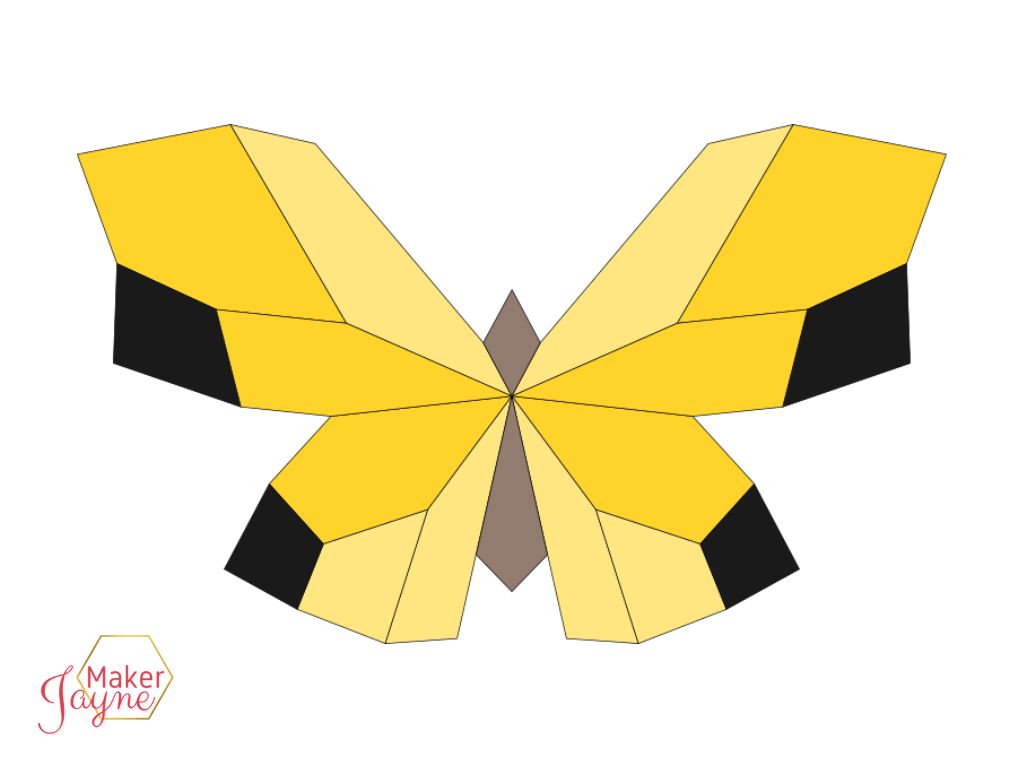 This color layout is based on the yellow/orange butterfly search results.
I chose the purple fabric because it had a pop of orange in it that I thought tied it together with the orange fabrics I chose.
Even though my fabric choices are not an exact match with the colors from the example above, it goes to show you that you don't always have to try to match your color inspiration exactly. You have plenty of room to have fun, play and experiment.
 Above are my "orange butterfly" fabric color choices.
Red Color Inspiration
The last color I searched for was red and I was amazed at all the red butterflies that I found! I had no idea that there were so many different colors and arrangements within the butterfly world. Check these out!
Isn't it interesting the difference between the male butterfly and the female butterfly below? One has just a small spot of red on its wings below its body, whereas the other has red both above and below its body. And the arrangement of the white between the two is very interesting, as well.
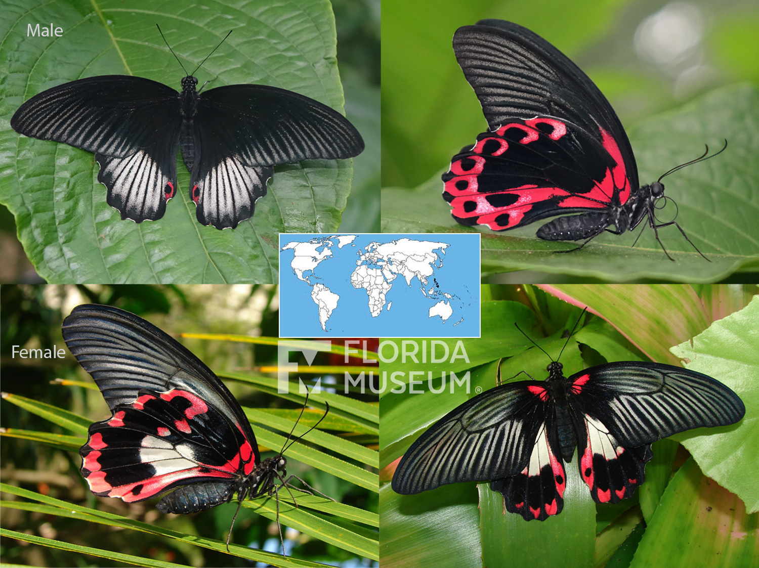 Papilio-rumanzovia
Red is already a bold color but when paired with the stunning arrangements of white and black, these butterflies are out of this world.
I don't usually work with red, or black... or white, for that matter. But as soon as I saw these butterflies I knew I wanted to get outside my color comfort zone. How could you not have fun experimenting with these as your inspiration?
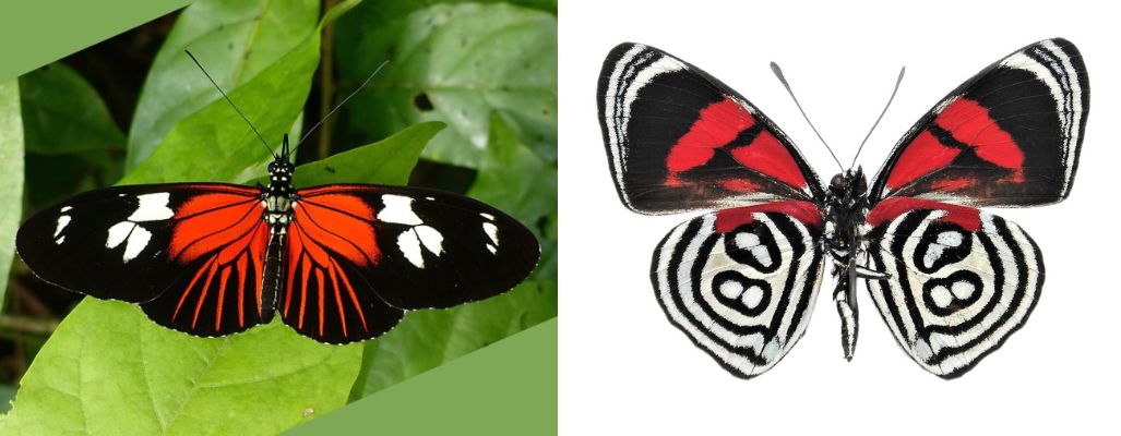
Below is what I came up with based on my red findings. I really liked the graphic lines that the examples above have in them, whether it's black and red striping or black and white, I knew I wanted to incorporate that somehow.
 Above is the color layout I chose based on my "red butterfly" search results.
So I was super happy when I found the red Giucy Giuce fabric in my stash. It's got the graphic element I was going for. And I was able to fussy cut it to achieve a mirrored effect similar to the butterfly examples.
I also found two lovely fabrics, one black and one white, that both have a bit of red in them to pull all the fabrics together. I'm really happy with how this last one turned out. I think it's my favorite of them all.
 Here are my "red butterfly" fabric choices.
Choosing Fabric Colors for Your Next Quilt Project
There are so many different colors to choose from. It can often feel overwhelming sometimes but it doesn't have to be that way. By learning how to use a few simple color tools you can move past the overwhelm and choose colors for a quilt with ease.
As you look at nature for quilt color inspiration, pay attention to the colors that are standing out to you. Your interpretation of the colors you see may look completely different from the colors I see. We each see the world in a different way and this is a beautiful thing.
I hope you'll try this method for choosing fabrics for your next quilt. If you do, come and let me know how it goes inside my FREE community Patchwork Pals.
Do you have another method that you like to use to choose fabric colors for your quilts? Share your ideas with other MakerJayne readers inside Patchwork Pals!


